
Search
Product components
Explore our product-related Framer components that connect your site to Shopify.
Components in this doc:
Loading…
Out of Stock
Select Size
Add to cart
Buy now
Quick add
$150
Purchase Button
Handles Add to Cart and Buy Now functionality with state management for product availability and variant selection. Updates dynamically based on product status and variant selection.
Controls
ProductID
Connect to CMS variable (required)
VariantID
Populate with specific variant ID (optional)
Instance
Connect button states: Available, Out of Stock, Loading, Select Variant
Type
Select Add to Cart or Buy Now functionality
Trigger Cart
Enable or disable the tap event that is connected to your cart overlay trigger component. If in your cart overlay, disable to prevent the cart from closing.
Tips
Debugging
If your button isn't working, make sure your shopifyProductID is set. If your product has variants, the variant selector is required on the page unless you have manually set the variantID.
$200
Price
Handles standard and sale price displays. Updates dynamically with variant selections.
Controls
Product ID
Connect to CMS variable (required)
Price
Connect to CMS variable (for preview)
Varying Prices
Toggle between displaying Minimum Price (i.e. "from $50") or Range (i.e. "$50-$100") when the product has multiple prices and a full variant selection hasn't been made yet.
Prefix
If showing a minimum price, set the text to prefix (i.e. "from")
Format
Set your currency configurations
Fonts
Set fonts and colors for Regular and Sale price
$200
$120
Price Compare
Displays Shopify Compare-at Price values. Auto-hides when no compare-at price exists.
Controls
Product ID
Connect to CMS variable (required)
Compare Price
Connect to CMS variable (for preview)
Prefix
Text to display before the compare-at-price (i.e. "was")
Format
Set your currency configurations
Fonts
Set fonts and colors for Regular and Sale price
Strike
Configure strikethrough styling (optional)
20% off
Save $10
Price Discount
Calculates and displays percentage-based or amount-based discounts. Auto-hides when no discount applies.
Controls
Product ID
Connect to CMS variable (required).
Price
Connect to CMS variable (for preview).
Compare Price
Connect to CMS variable (for preview).
Type
Toggle between showing a Percent (%) or Amount ($) discount.
Style
Configure background and sizing
Text Format
Set your text format using {{discount}} to display the value.
Varying Prefix
Text to prefix when a product has multiple discounts and a full variant has not been selected yet.
Format
Set your currency configurations
Variant Selector
Renders and manages available product variants with selection states. Auto-hides when product has no variants.
Controls
Product ID
Connect to CMS variable (required).
Image IDs
Connect to "Image Variant IDs" CMS variable (optional, if you want to trigger image changes or display Variant Images)
Style
Choose between Buttons or a Dropdown
Buttons
Style your buttons layout and states
Dropdown
Style your dropdown states
Behavior
Choose to auto-select first available variants or load without any selection Choose to show or hide variant groups that only have one option
Images / Type
Choose between None, Gallery, or Scroll Sections to control image triggers
Images / Two-Way
Enable if you want to enable clicking on an image to change the active variant in the selector
Behavior / Filter
Toggle between showing all variant groups in the selector (default), or filter by Equals or Doesn't Equal. If filtering, set the list of Variant titles to filter by (i.e. "Color", "Size", etc.)
Behavior / Action
Choose what happens when you click on the variant in this component. It can update the selected variant (default, recommended), or on a product card, can Add to Cart or Buy Now. If setting it to Add to Cart or Buy Now, be sure that the variant selector only displays a single variant group (i.e. "Size").
Behavior / Select 1st
Enable or disable auto-selecting the 1st variant that's in stock.
Behavior / PDP
Set to Yes if the component is on a Product Display Page (PDP). Otherwise, set to No – even if it exists in a product card that also appears on the PDP under related items.
Behavior / Singles
Show or hide the variant selector if the variant group has only one item.
Behavior / Out of Stock
Allow or disable selecting a variant option that's Out of Stock.
Title
Show or hide variant group titles and customize the styles
Selected Value
Show or hide a text display of the selected value beside the variant group title, and then style it.
Color Swatches
Turn on or off Color Swatch UI, and customize styles. In the plugin under Store Settings, configure the values below and one-click save to update all components: Set a list of Titles that will show the Color Swatch UI (i.e. "Color") Set a list of Values and Hex Codes (i.e. "Red" "#FF0000")
Image Swatches
Turn on or off Image Swatch UI, and customize styles or choose to inherit from the Color Swatch UI. In the plugin under Store Settings, configure the values below and one-click save to update all components: Set a list of Titles that will show the Image Swatch UI (i.e. "Pattern") Upload your images and matching Variant values (i.e. "Leather")
Variant Images
Turn on or off Variant Images to display your CMS Images that are mapped to each variant and customize styles or choose to inherit from the Color Swatch UI. In the plugin under Store Settings, configure your list of Titles that will show the Variant Image UI (i.e. "Style") and one-click save to update all components. Once turned on, connect the "Image 1" "Image 2" "Image 3" etc. variables to your CMS. Make sure Image IDs field is also connected to the CMS.
Select Size
Variant Status
Displays variant selection requirements and validation states. Can be standalone or nested within Purchase Button.
Controls
Product ID
Connect to CMS variable (required)
Text
Configure message and appearance
1
Quantity Selector
Input component for product quantity selection with built-in inventory limit validation. Provides increment/decrement controls with dynamic maximum values.
Controls
Product ID
Connect to CMS variable (required)
Instance
Connect button states: Plus/Minus, Active/Disabled
Style
Configure quantity text appearance
In stock
4 left in stock
Stock Status
Displays inventory levels and availability messages with configurable thresholds.
Controls
Product ID
Connect to CMS variable (required)
Threshold
Set inventory level for state change
Instance
Connect states for above and below threshold
4 left in stock
Inventory Counter
Display the available inventory count of a selected product or variant.
Controls
Style
Configure quantity text appearance
One-time Purchase
$39.99
Subscribe & Save
$29.99
Selling Plans
Manages one-time purchase and subscription options. Integrates with Shopify Sell Plan apps such as Seal Subscriptions.
Controls
Product ID
Connect to CMS variable (required)
Instance
Connect subscription interface design
Name for customization
Order Attribute Input
Allow users to input a text string to add to their order as an attribute. Appears in their cart on Framer and on Shopify.
Controls
Styles
Customize form text and styles
Required
Set the field as optional or required
Validate email
Set email validation if required
Attribute title
Set the attribute title sent to Shopify
Active Variant Image
A component that displays the currently selected variant from the Variant Selector component.
Controls
Product ID
Connect to CMS variable (required).
Type
Choose your image to Fit or Fill the component
Image(s)
Choose between auto-setting the amount of images (each time you add one, another variable will appear) or manually set the number. Then connect each Image variable to the CMS.
Gallery (Auto)
This Gallery contains just two components – Static Image Variant for the thumbnail and Active Image Variant for the main image. It also just contains just two Framer variants – one for Desktop, one for Phone. Get going right away with no complex nesting or interactions.


Slideshow
A component that mimics Framer's native slideshow, but with CMS images and that jumps to the active variant if the Variant Selector prop on Images / Type is set to "Gallery".
Configure dots on the component itself, and/or use the Arrows and connect your local components.
For demos and remix links, visit fc-image-variants.framer.website
Controls
Style
Configure image fill or fit, number of items, overflow, padding, gap, and radius
Dots
Configure the styling of the dots as pagination
Arrows
Connect your local arrow design components for prev/next and disabled/active (separate component from Slideshow)
Shop Pay
A one-click Buy Now button that brings your customer directly to the Shopify checkout with their Shop Pay info pre-populated and ready to go.
Note that checkout language is not supported with the Shop Pay button.
Controls
Product ID
Connect to CMS variable (required)
Text
Set "Buy with" or custom text if needed
Color
Choose from Shopify-approved color combinations
Quick add
Quick Add Button
Let customers add products directly to their cart from any page with a single click. This button instantly adds the first available variant to the cart –– no selection necessary.
Controls
Product ID
Connect to CMS variable (required)
Instance
Connect button states: Available, Out of Stock
Type
Select Add to Cart or Buy Now functionality
Trigger Cart
Enable or disable the tap event that is connected to your cart overlay trigger component. If in your cart overlay, disable to prevent the cart from closing.
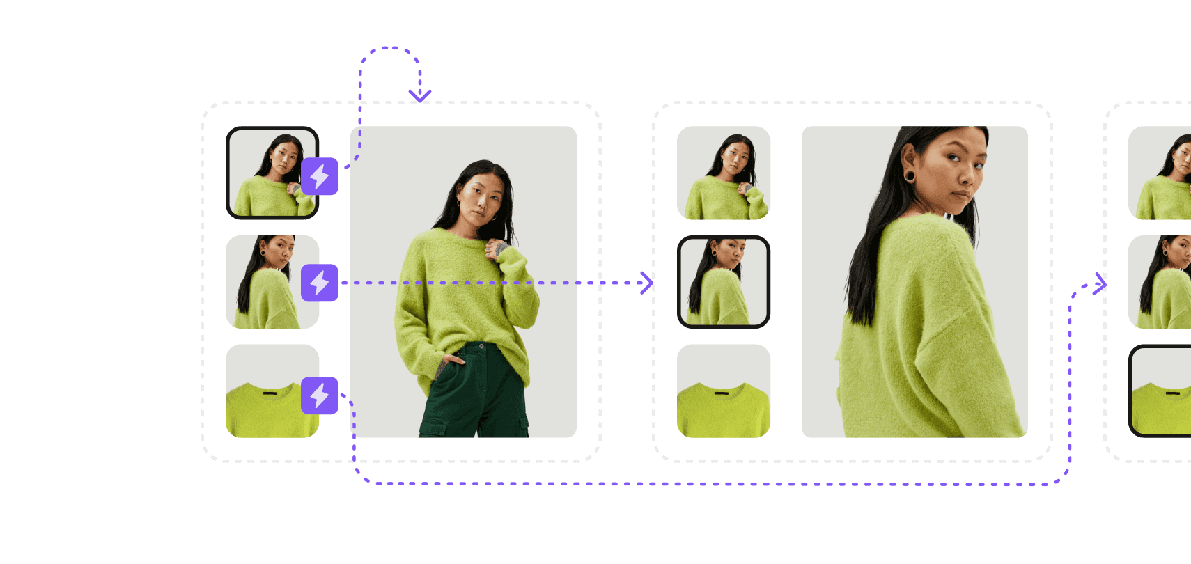
Gallery (Custom)
The Gallery is configured natively in Framer, with the thumbnail images using our Static Image Variant component.
This component has a tap event that is used to transition between the gallery states, and also gets triggered when a new variant is selected from the Variant Selector.
You can detach all the instances for full customizations, but keep in mind variable connections and states may get reset in the process.
For demos and remix links, visit fc-image-variants.framer.website
Static Variant Image
Display a fixed image from the product gallery, respective to the image number.
Can be configured to be a thumbnail to connect to the Variant Selector and/or the Selected Variant Image component.
Can also be configured to only be visible when a specific variant is included in the Alt Text of the image, set on Shopify.
Controls
Product ID
Connect to CMS variable (required).
Image
Connect to CMS Image variable incrementally (required).
Image Number
Set to match the image number connected above.
Filter Variants
If set to Yes, this component will hide if the Image Alt Text (set on Shopify) does not contain the value of the variant.
Filter Match
Toggle between "Any" or "All" filter matching. For example, your product has "Blue" and "Red" Color variants, along with "Small" and "Large" Size variants – and the user selects "Red" and "Small". If "Any" filter match is selected, the image would require the alt text to contain the word "Red" OR "Small" to be visible, so the alt text of "T Shirt (Red)" would have the image appear. If "All" filter match is selected, the image would require the alt text to contain the word "Red" AND "Small" to be visible. So "T Shirt (Red)" would not be visible, but "T Shirt (Red, Small)" would.
Thumbnail
Enable or disable thumbnail functionality.
Thumbnail / On click
Choose between triggering its Tap Event you can connect to anything (along with updating Active Image Variant component), triggering a Scroll Section (to #image-X), or doing nothing (None).
Thumbnail / Styles
Style your Hover and Active states along with the Transition.
